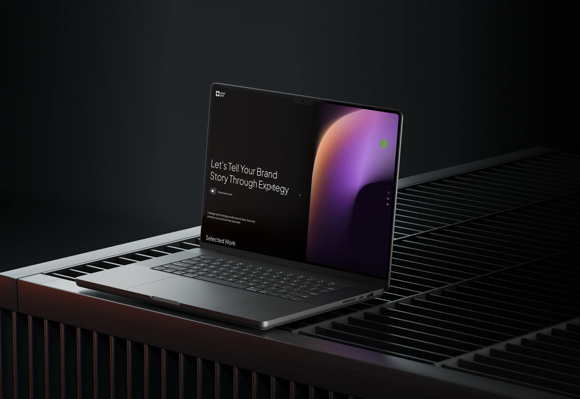
Hore™
A bold identity for an apparel label that turns contrast into a signature.
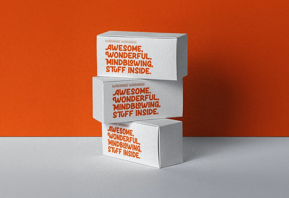
{ The Challenge }
Hore™ was growing on word of mouth, but the brand looked like a side project and the message changed on every page.
It needed a system that said who it was in five seconds, and a site that turned visitors into fans.


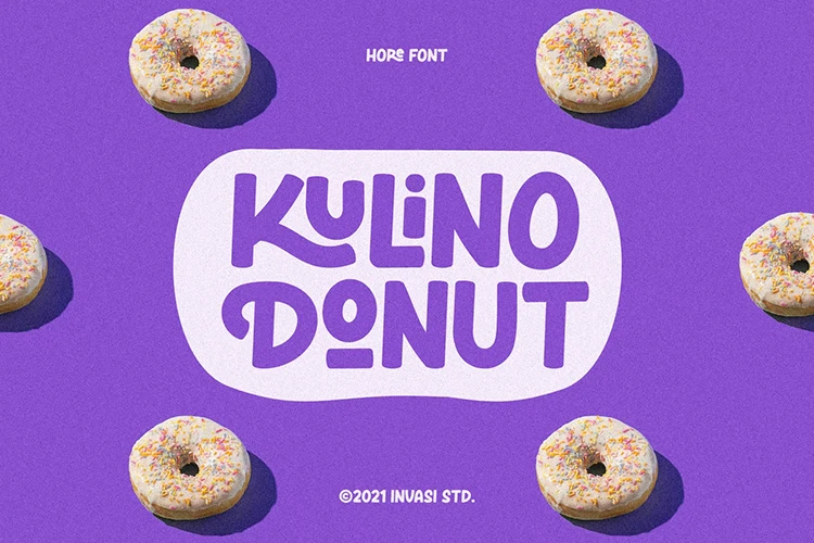
{ Our Approach }
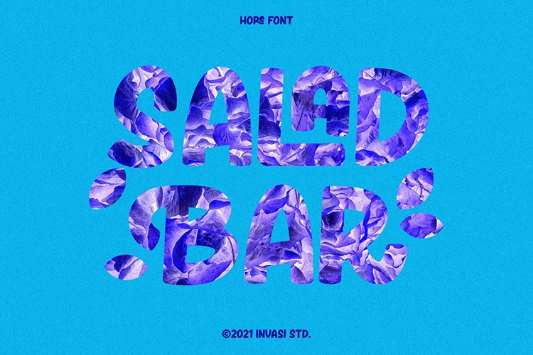

WHAT WE DID
01 — Strategy before pixels
We named the brand's stance and built every visual choice on it.
02 — Clarity over noise
A confident system stripped the brand back to its essentials.
03 — Craft as standard
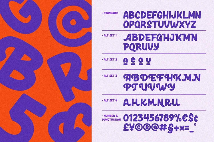
Editorial typography and tight art direction raised the perceived value.

{ The Results }
Within two weeks of launch the brand looked the part, and sales conversations got easier.
3.4x
Brand recall
2 wks
Turnaround
+182%
Site engagement
−40%
Bounce rate
5
Campaign drops